A nice feature of traditional web applications is a lot of things we’d nowadays do with modals or popovers required a whole page transition. This limitation of the medium had good spillover effects:
- Every object in the application has a URL, and can be bookmarked.
- Navigation can be parallelized. You can’t open a hundred modals at once, but you can middle-click a hundred links.
- You can edit URL query parameters, and navigate “unofficially” by trimming the URL, or replacing identifiers, to get behaviour the application doesn’t support.
- Having an entire desktop-sized page’s worth of real estate for an object means developers can add information and affordances they wouldn’t put in a modal, which empowers the users.
- Entities that have a URL feel like first-class objects in the system. They feel like tangible, persistent things.
The constraints of hypermedia, and the desktop form factor, created empowering software. The keyboard and mouse allow high-bandwidth, high-frequency interaction. They permit creation. Users were expected to be “computer literate”, to learn to operate the computer before a specific software program. Desktops are interactive.
Phones are cramped, bad at multitasking, impossible to type on. Nothing is expected of mobile users. Phones can only be interpassive.
And so the trend in UI design, for the past 15y, has been towards less information, fewer affordances, and turning free-standing pages into transient modals. Interfaces are stripped, made ephemeral, and apps become Fisher-Price toys for users to paw at.
First-Class Objects
Calibre has a button that brings up a table of background jobs:
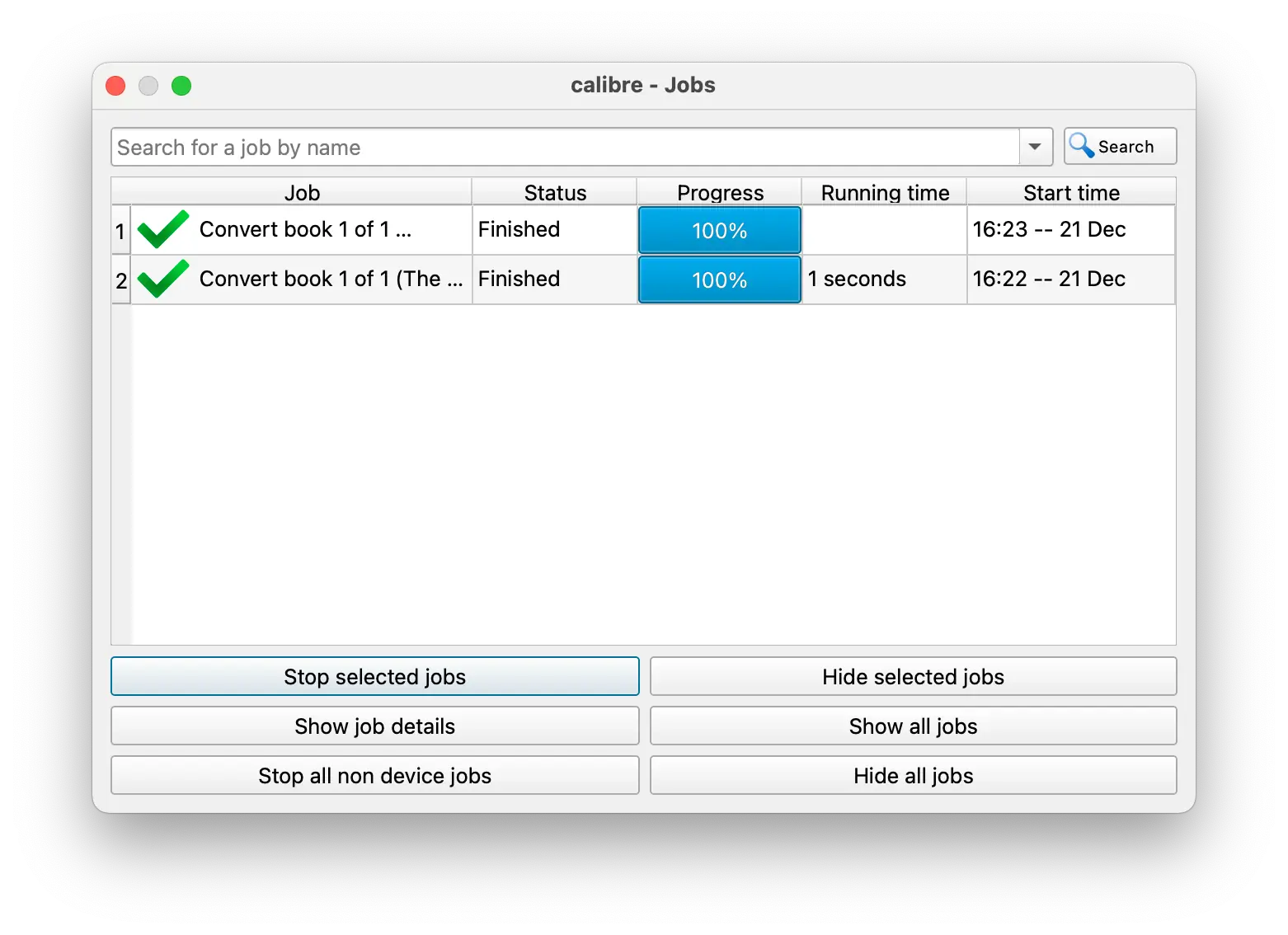
You can watch the progress of a job, kill it, and open its logfile. Jobs are first-class objects: real and graspable.
Ephemeral Objects
A common antipattern nowadays is where you can infer the existence of some entity, but you can’t interact with it. You are screened from it.
I had a problem with iMessage where I uploaded a photo, and sent some messages, but noticed the messages weren’t sending. Then I saw this thin progress bar at the top, stuck at 95%, and thought: the image upload is stuck, and everything is queued up behind it. But I can’t cancel the upload, because the progress bar doesn’t have a cancel button, it doesn’t show a button on hover, and you can’t click on it to bring up a menu.
There is an entity: “asynchronous job to upload IMG_0451.jpg”. But I can’t touch it. I’m on the wrong side of an event horizon: I can see it, but it can’t see me.
Calibre is the work of one Kovid Goyal. iMessage is the work of a company with a market cap of 3.85×10¹² USD. Which is more functional?
Case Study: Reminders
In Reminders, the properties of a task are visible only in this fragile popover. Touch anything and it goes away.
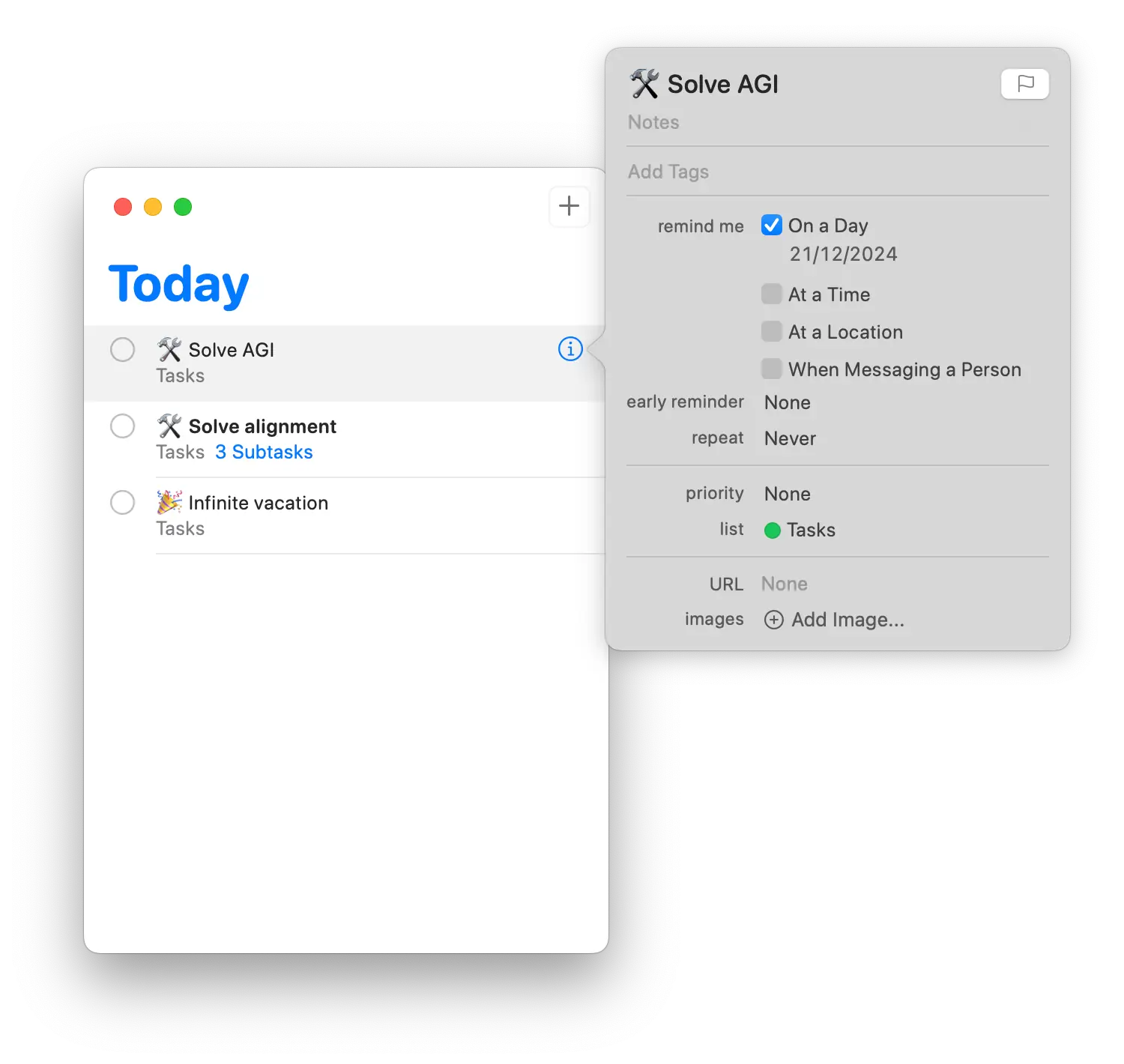
Reminders supports subtasks, but only one level deep, and it’s such an afterthought I only found it by accident, while dragging a task up.
It’s hard to navigate from a task to its subtasks. If you click on the “3 Subtasks” link it takes you, not to the task, but to the list containing the task:
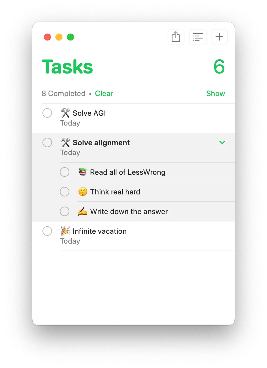
You can’t navigate to a task because there is no free-standing task object in the UI. There is only “a task in a list”, which is a much less useful concept.
Case Study: Linear
In Linear, clicking on a task takes you to a distinct page for that task. It has a URL, and takes up the entire screen. All the properties of a task, and the task’s change history, are visible.
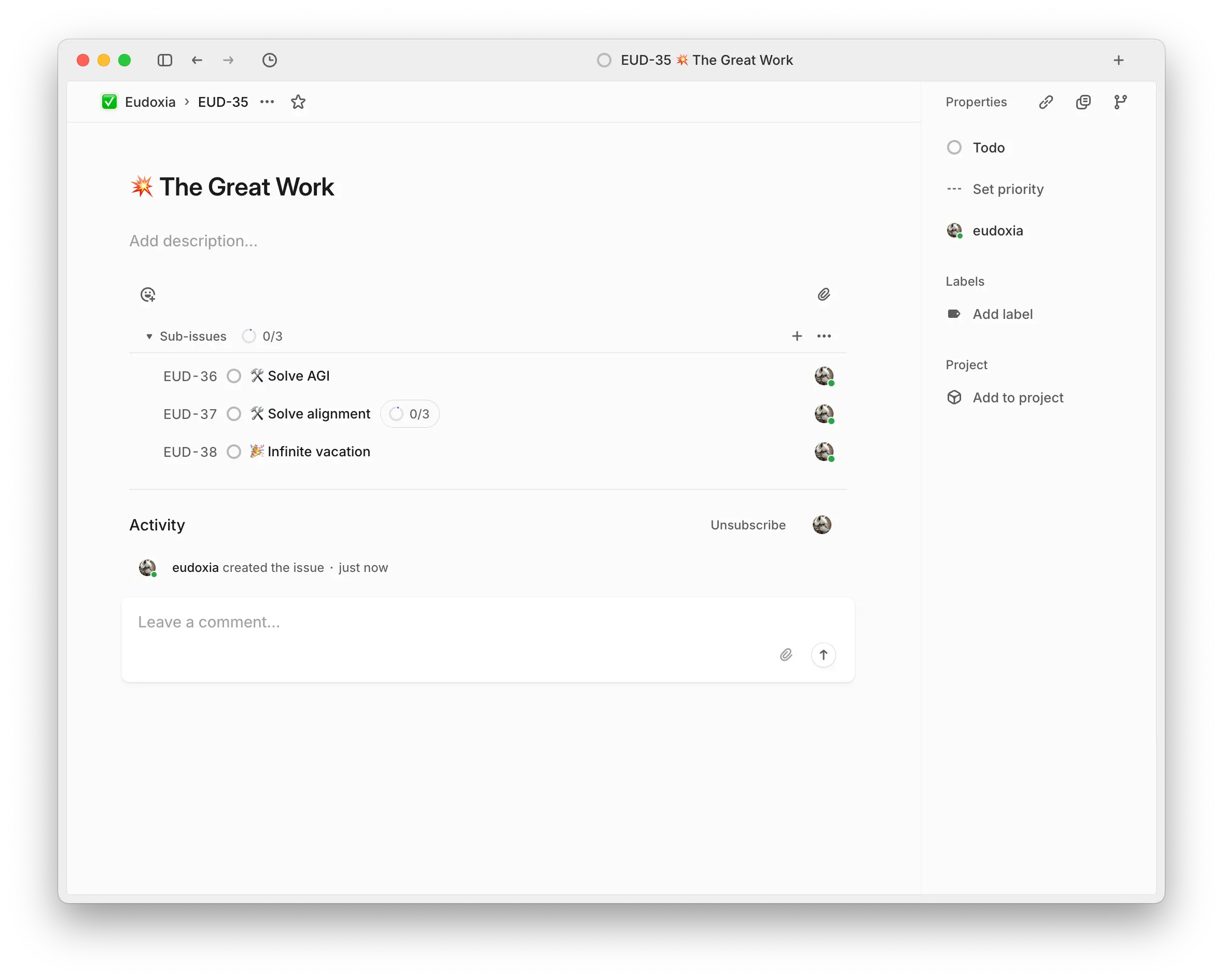
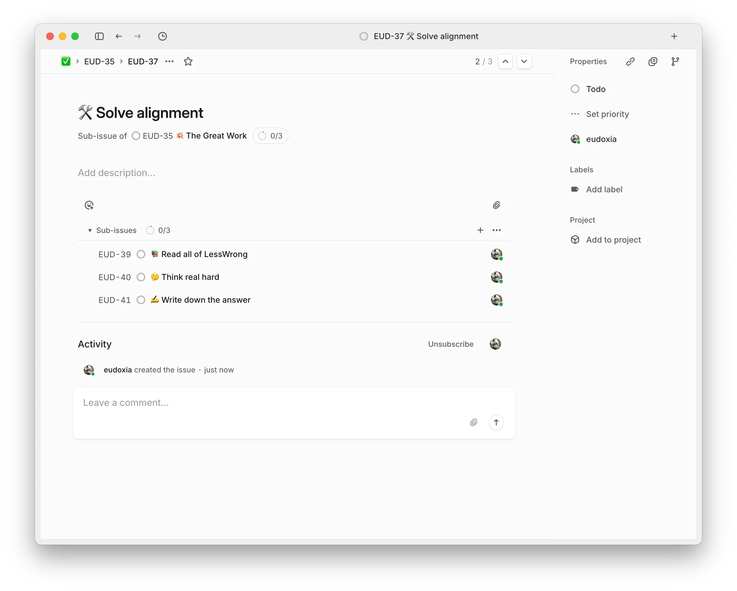
But, crucially, you can see the table of subtasks. From a task’s page, you can navigate downwards into its child tasks, or up to the parent task. This uniformity and generality lets you have infinitely-nested subtasks while keeping the UI simple, because no matter how high or deep you are, a task is a task, it has a parent pointer and a list of subtasks.
In the real world, tasks can be broken down, recursively, to any depth. Linear supports this naturally. In Reminders, you are constantly fighting against the system. To break down a task you have to move it one level up, into a list, to break down a list you have to move it up into a folder of lists, and so on.
Linear beats Reminders because it has the right ontology: the objects (tasks, projects, views), properties (completion states, due dates), and relations (child of, parent of, blocked by) are fit for purpose. And because the UI exposes the ontology without compromises. The vocabulary of the ontology and that of the UI are one and the same: a task in the UI is the same as a task in the domain of discourse of Linear.